SEO: CCW Redesign For Usability And SEO
Redesign Overview
As content manager of Crowd Control Warehouse, an online store for traffic, crowd control, and safety products, I developed and implemented a redesign plan of the site’s homepage, landing pages, and mobile design to better accommodate SEO best practices and mobile usability. I provided mockups to guide redevelopment of our Shopify theme, served as project manager for development, and customized the new theme with graphics and copy. Now I continue to help this client work towards SEO goals by providing weekly blog post and guest post content.
Use the slider to see the redesigned version.
For this ecommerce Shopify site, I contribute to SEO strategies with the in the following ways:
Mobile usability improvements for better mobile ranking: A
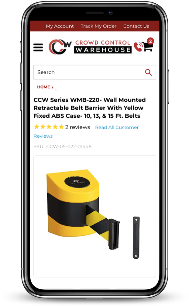
Element A shows the original mobile menu which took up a large amount of space with links that were too close together. The updated version on slide 2 is optimized for Google’s mobile usability standards with less menu crowding.
mobile usability improvements for better mobile ranking: B
Element B demonstrates how the original mobile design auto-zoomed upon hover. While this worked fine for web, on mobile it interfered with the user’s ability to easily scroll down the page for further content. In our redesign, we disabled this zoom for mobile.
Keyword Research
I frequently help this client strategize their product titles for their own site as well as external platforms like Amazon and Walmart.com based on each platform’s best practices and keyword data.
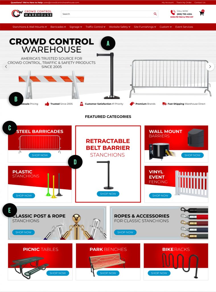
Original Design.

optimizing content for search engine visibility
Element A shows where the original homepage hero banner did not have live text. Instead, the text was photoshopped into the banner image. This means the text was practically invisible to google.
LAYOUT DESIGN TO PRIORITIZE KEYWORD-RICH CONTENT ABOVE THE FOLD
Element B shows how the homepage banner took up the entire screen above the fold. This meant there was no keyword-rich content in the most valuable portion of the website.
avoiding banner blindness
Element C shows product tiles which were overly graphic and had no hover effect, making them look more like banner ads than dynamic content.
Promoting Scan-ability
Element D provides an example for the original design’s staggered layout which did not take advantage of typical eye scanning patterns.
alt tags and meta tags
Element E demonstrates tile content which again showed only a flattened image with no live text, alt tags, title tags, or meta tags.
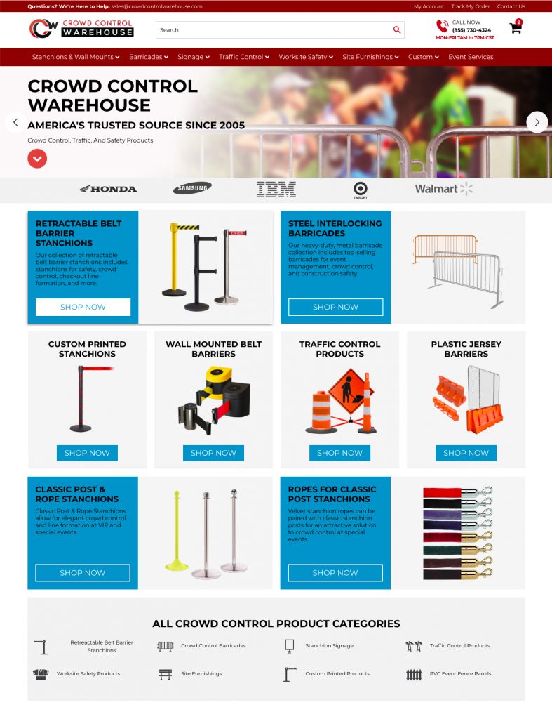
Redesign

optimizing content for search engine visibility
In my redesign, all flattened text was replaced with live text, visible to Google.
LAYOUT DESIGN TO PRIORITIZE KEYWORD-RICH CONTENT ABOVE THE FOLD
In my redesign, the banner height was reduced by ~40% and an anchor link was added to help users skip to helpful content below.
avoiding banner blindness
In my redesign, we adapted the product tile designs to optimize for readability, keyword-rich copy, and simple product display to prevent banner blindness.
Promoting Scan-ability
My redesign implemented usability best-practices for arranging content in an easy-to-scan layout.
alt tags and meta tags
In our redesign, we added a section at the bottom of the page for an icon menu. This provided another opportunity to include keywords in link titles and alt tags.
Project highlights:
- 86% increase in organic users 86%
- 21% improvement in site upload speed 21%
- 18% decrease in bounce rate (users who leave the site immediately) 18%
SEO
Skills used:


